City of Cape Town
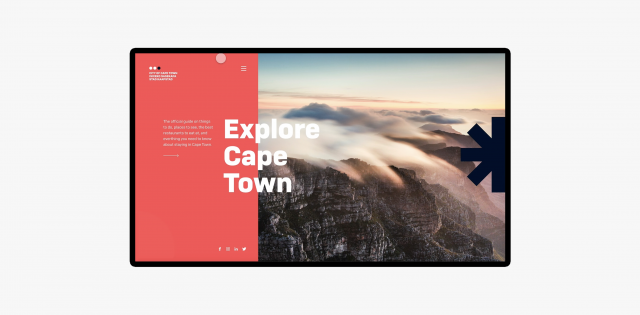
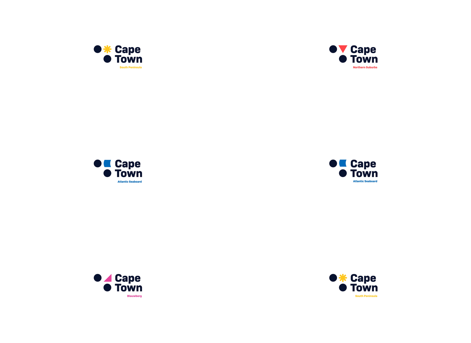
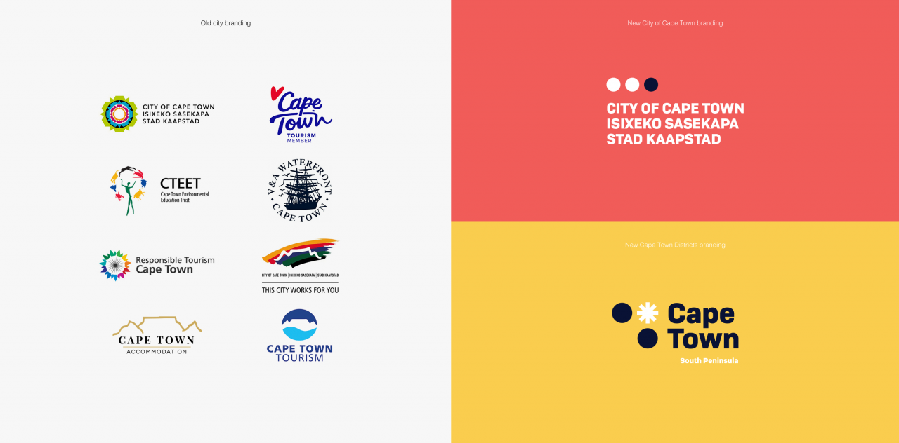
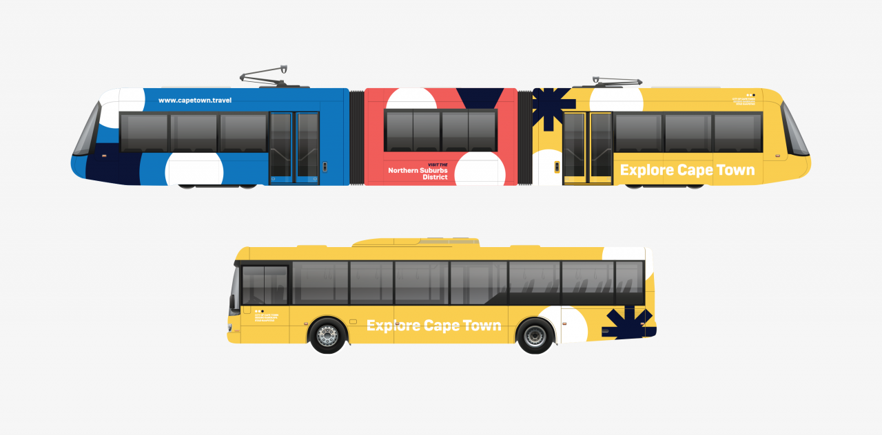
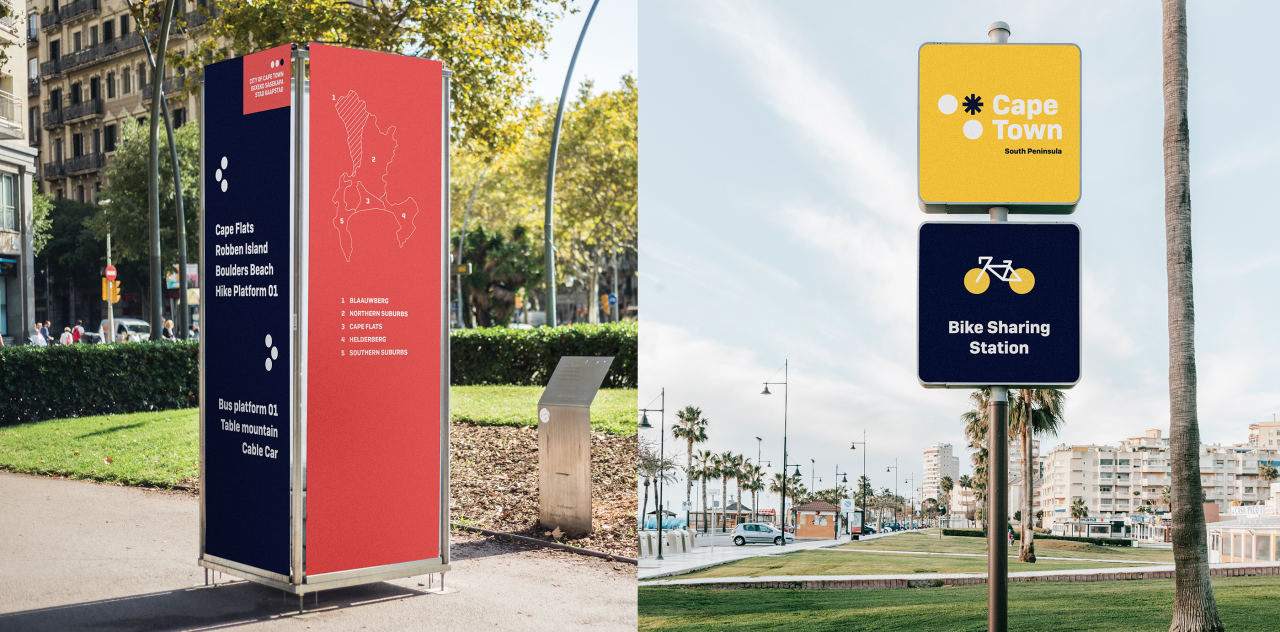
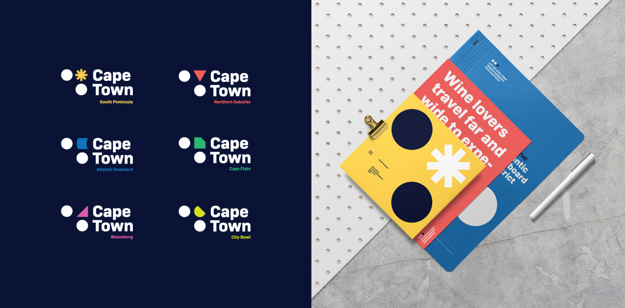
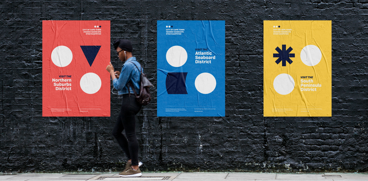
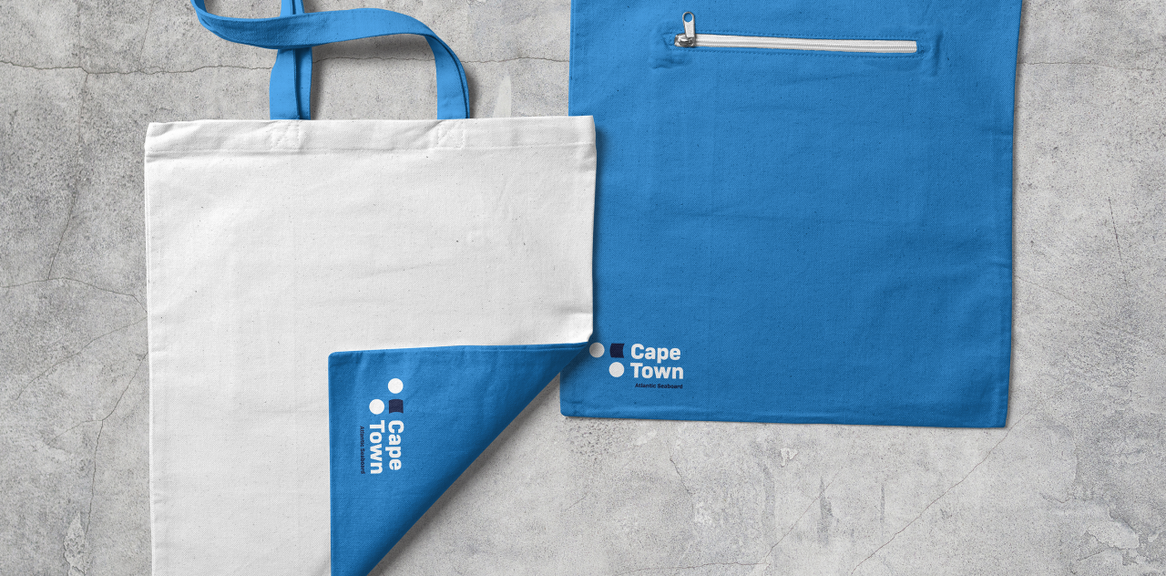
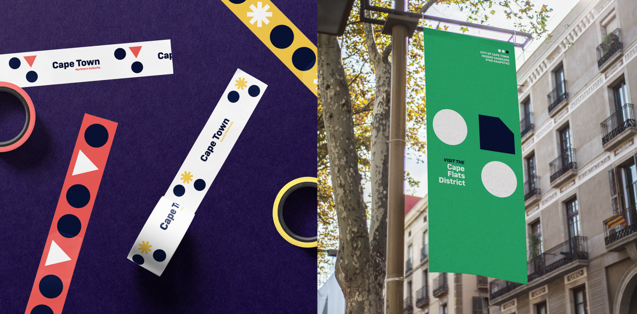
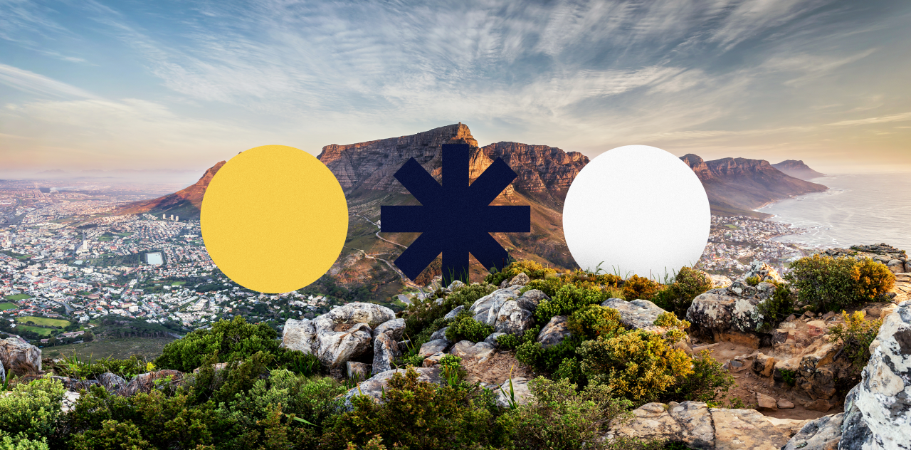
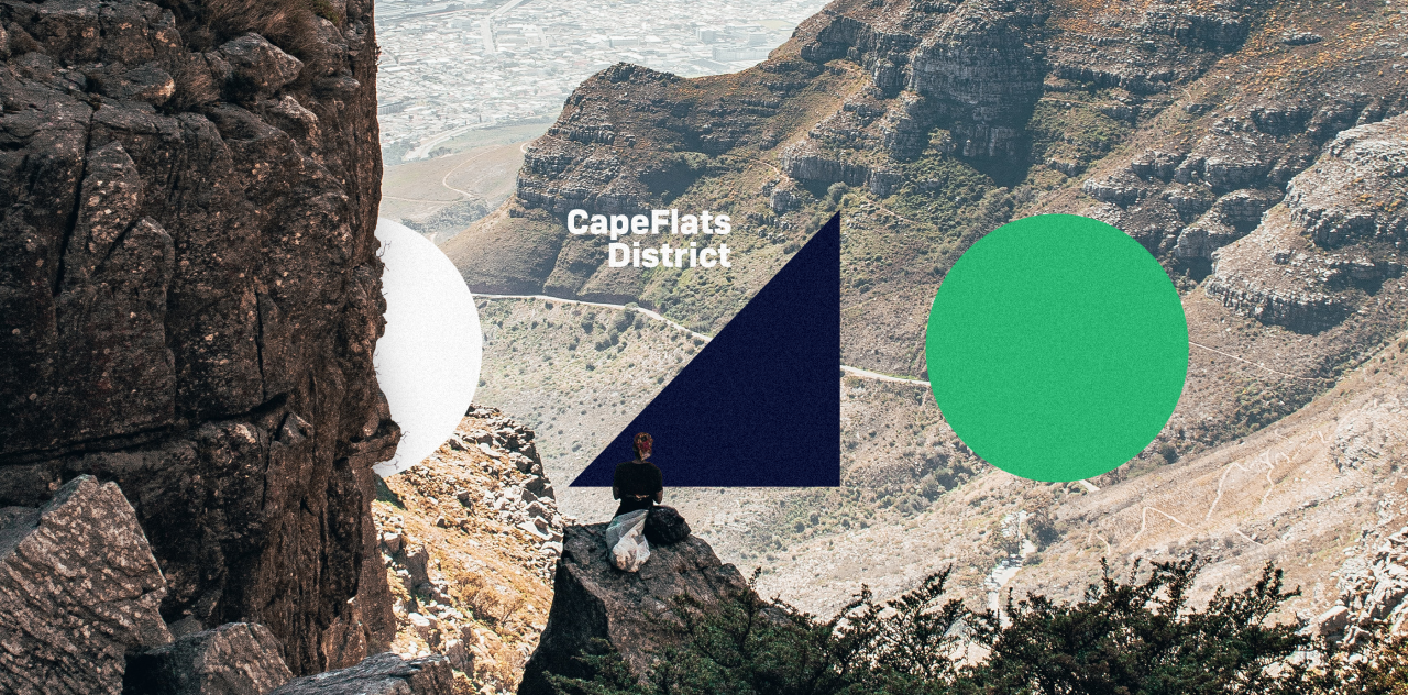
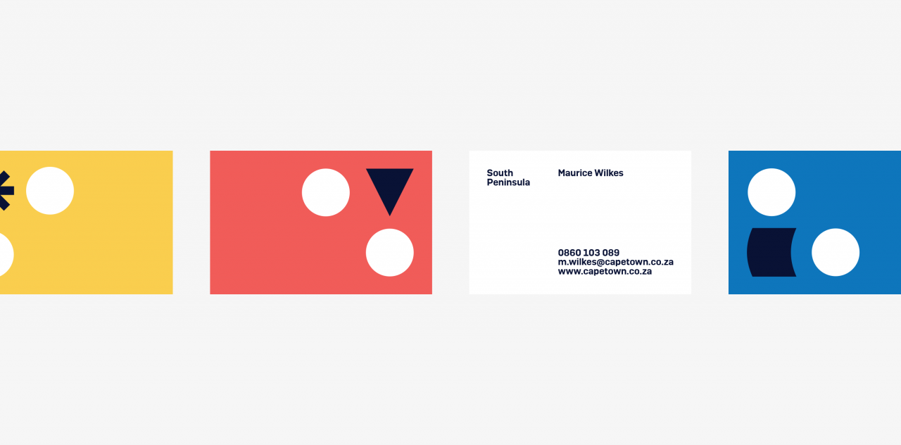
Cape Town is the place where it all happens. The Mother City hasn’t only got a rich history, but besides that, the combination of city life and nature is unique in this world. The current branding is chaotic and outdated. It is a collection of mismatched logo’s and designs. This hardly matches the uniqueness of this wonderful city. For this rebranding project we considered these different elements and chose to implement the three most important peaks in our remodeled design - Lion’s Head, Devil’s Peak and of course our beloved Table Mountain. We chose to represent these impenetrable mountains as three circles - a powerful unity. These spirals are constantly implemented in this new identity. As for the different Capetonian districts, they will all have a separate branding. For this, we used a hybrid logo. Each district has a separate color scheme, but the remodeled identity of Cape Town has been implemented as well. Two circles remain, but one will be substituted with a distinctive icon that represents each district.
As for the different Capetonian districts, they will all have
a separate branding. For this, we used a hybrid logo.
Drag
The Mother City hasn’t only got a rich history, but besides that,
the combination of city life and nature is unique in this world.

Play
